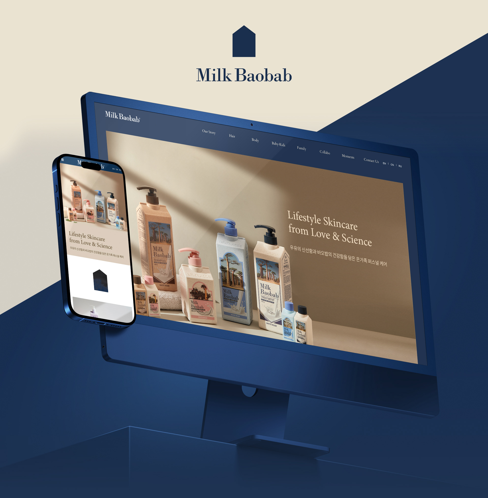

밀크 바오밥 공식 사이트 디자인 및 구축 : PC & Mo 반응형
MILK BAOBAB OFFICIAL SITE DESIGN & PUBLISHING : PC & MOBILE RESPONSIVE
퍼스널 케어 브랜드 밀크바오밥은
“온 가족이 안심하고 사용할 수 있는 프리미엄 퍼스널 케어”를 지향하는 브랜드로
“온 가족이 안심하고 사용할 수 있는 프리미엄 퍼스널 케어”를 지향하는 브랜드로
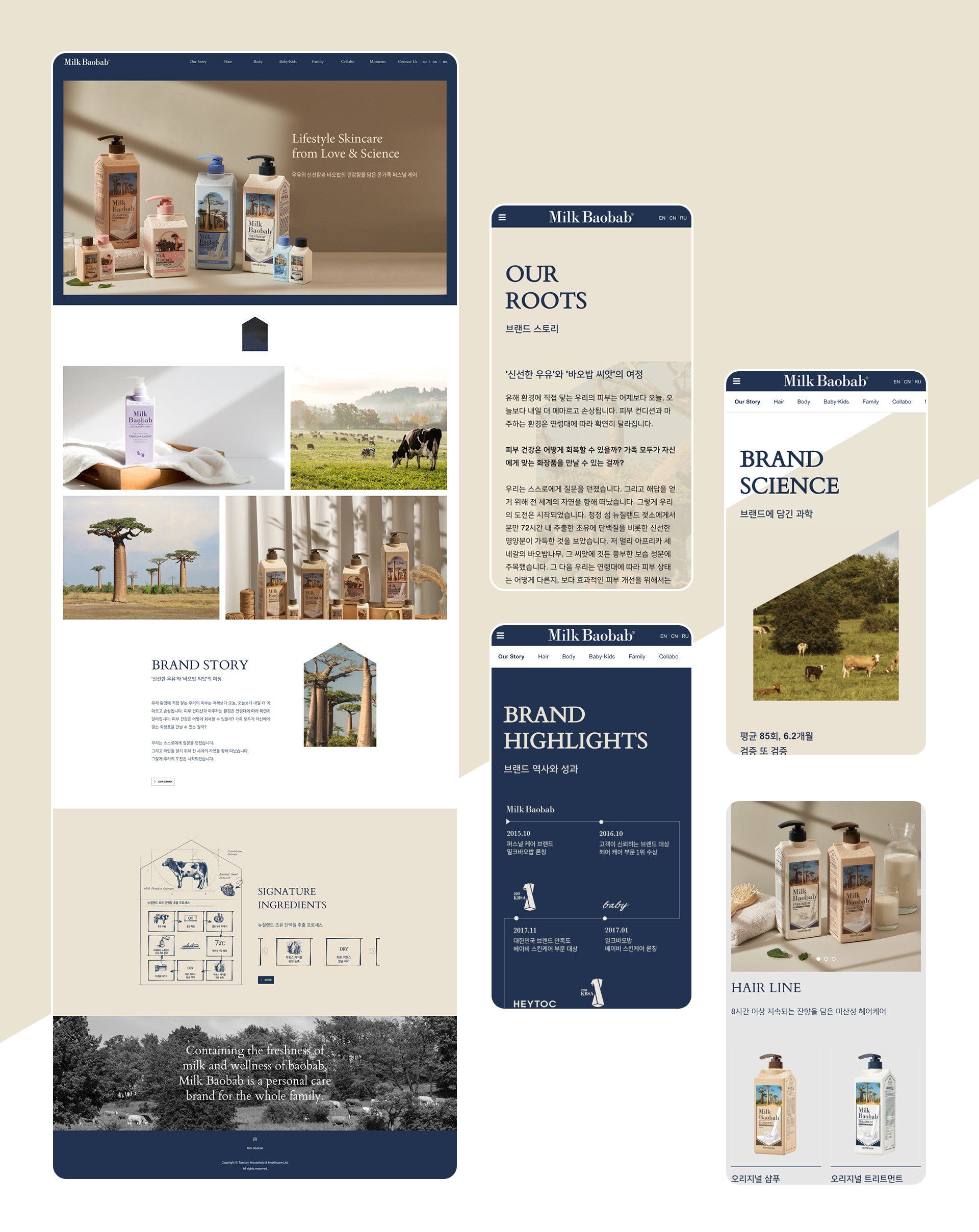
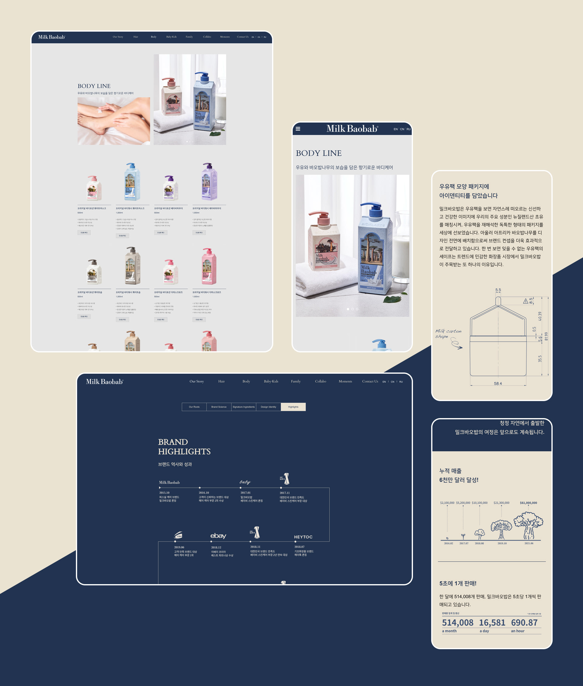
네이밍에 걸맞은 우유팩을 형상화한 형태 아이덴티티를 활용하여 고객에게 이미지를 각인시켰습니다.
웹사이트를 의뢰받고 진행하면서, 우유팩 아이덴티티를 활용, 브랜드의 아이덴티티를 유지하려 했습니다.
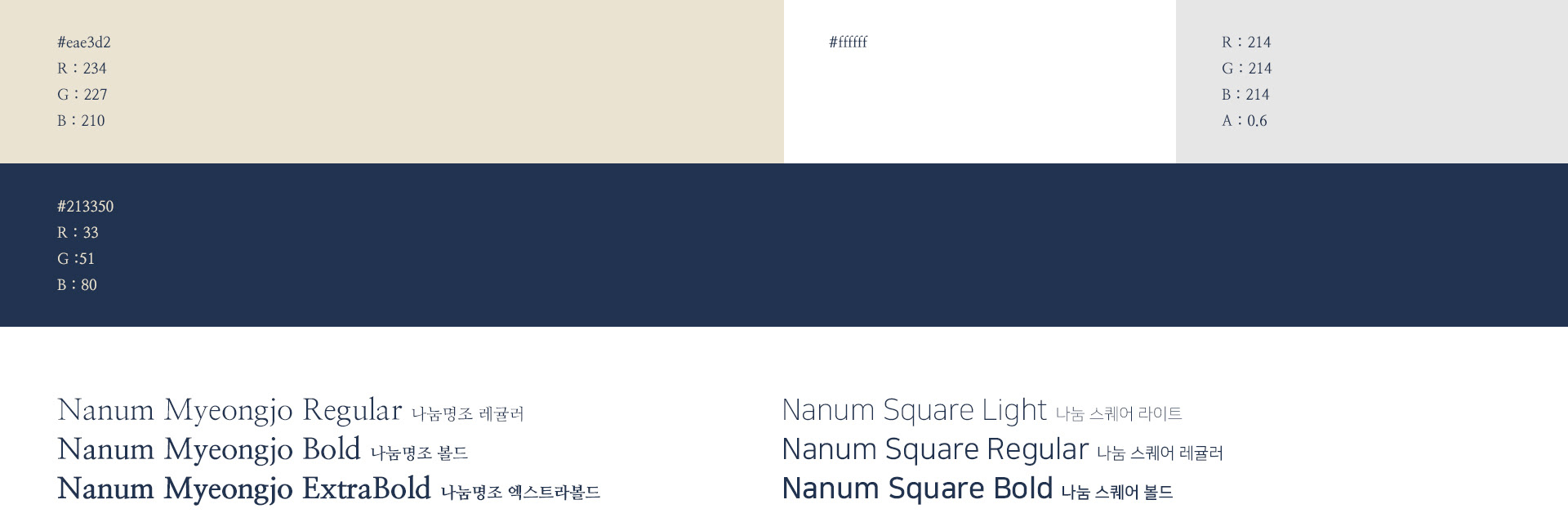
또한, “안심”이라는 단어에서 느낄 수 있는 신뢰감과 안정감을 차분하고 진중한 컬러칩으로 뽑아냈습니다.
웹사이트를 의뢰받고 진행하면서, 우유팩 아이덴티티를 활용, 브랜드의 아이덴티티를 유지하려 했습니다.
또한, “안심”이라는 단어에서 느낄 수 있는 신뢰감과 안정감을 차분하고 진중한 컬러칩으로 뽑아냈습니다.
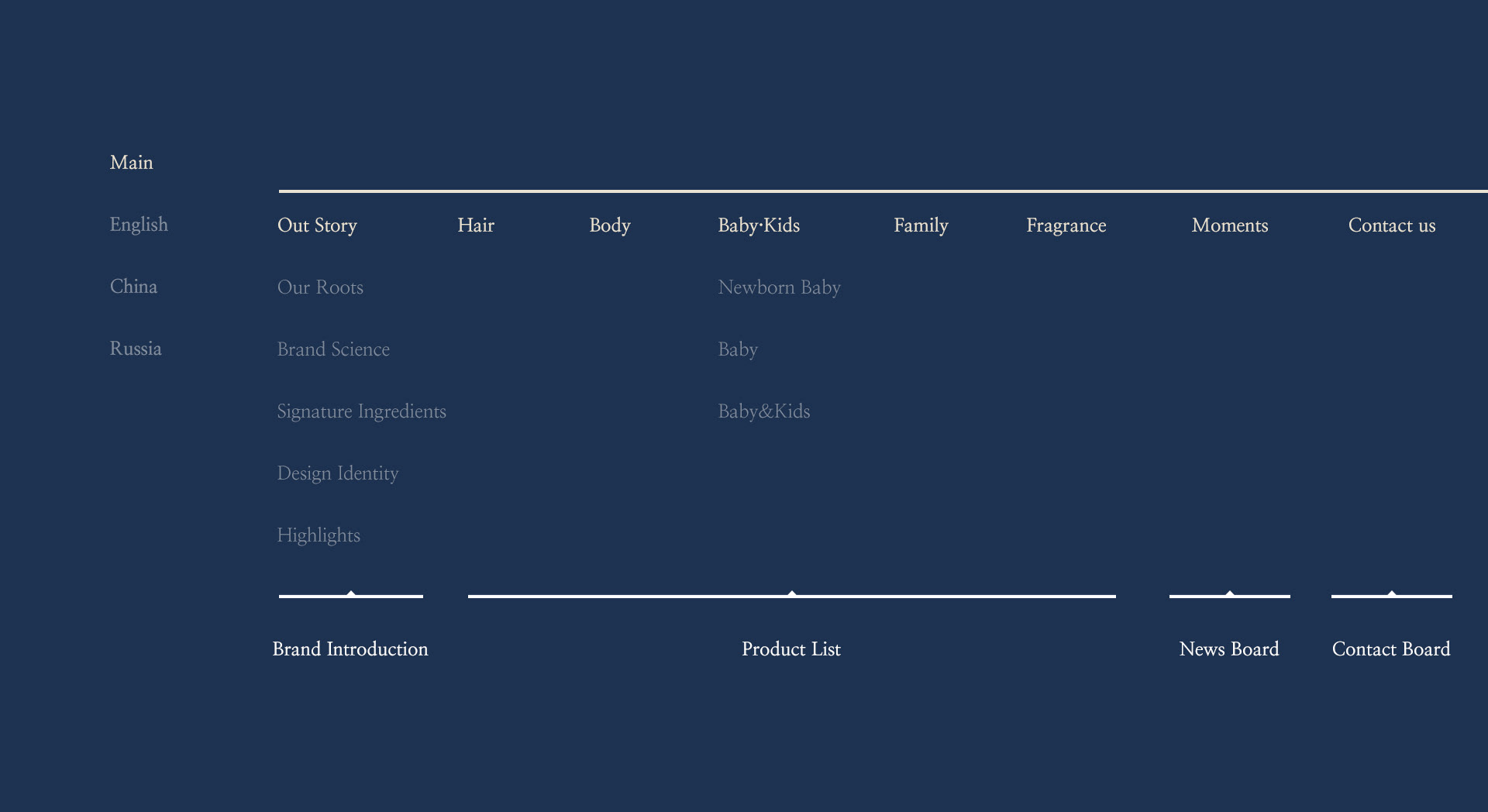
웹 기획, 사이트맵 구성, 웹 사이트 디자인, 폰트 및 컬러 스타일 구축, 페이지 생성, 다국어 사이트 구축 등 웹사이트 기획부터 디자인, 구축까지의 모든 과정을 진행하였습니다. 국문을 기본으로 글로벌 시장 진출을 위해 영문과 러시아어 사이트까지 확장 진행했습니다. 각 언어별 사이트는 모두 반응형으로 구축되어 다양한 디바이스 환경에서 편하게 접속 가능합니다.
Milk Baobab is a personal care brand that strives for “premium personal care that families can trust and use.”
We used shape identity, which visualized a milk carton, befitting the brand’s name, to imprint a lasting brand image on customers.
As we worked with the website commission, we used the milk carton identity to maintain the brand’s identity.
Additionally, we extracted calm, gentle colors from the word “trust,” which conveys the feelings of faith and relaxation.
Planning and designing the website, constructing the sitemap, establishing the font and color style, building the pages and multilingual websites.
We worked on all processes, from planning, designing, and building the website.
With Korean as the default language, we expanded the website to English and Russian for the brand to reach a global market audience.
Each language’s website is built responsive for easy access from any device.
client. Taenam Household & Healthcare Ltd. / 태남생활건강 주식회사
company. HEAZ
date. 2021
solution. imweb
company. HEAZ
date. 2021
solution. imweb